
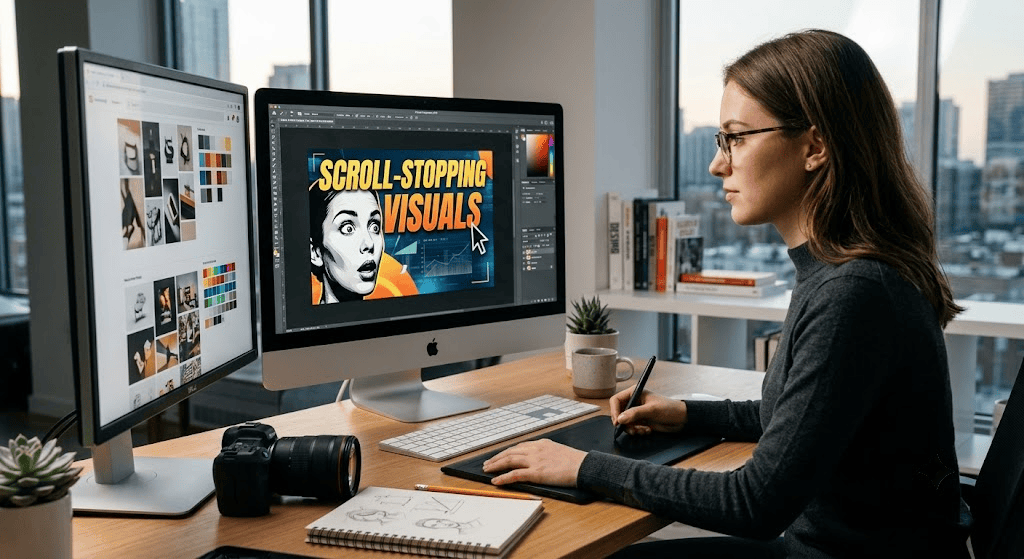
Understanding the principles of scroll-stopping visuals can completely transform how long users stay engaged with your digital content and graphics. Every day, users scroll through hundreds of feet of content on YouTube, Instagram, and LinkedIn. With so much noise, you only have a fraction of a second to capture someone’s attention. Whether you are publishing a new video or sharing a social media post, your visual assets—specifically your thumbnails and graphics—are the gatekeepers to your content. If your visuals fail to intrigue the viewer, your hard work goes unseen.
Designing for high click-through rates (CTR) relies heavily on visual psychology. First, prioritize contrast and bold typography. Viewers should instantly understand the topic of your content, even on a small mobile screen. Second, leverage color theory to evoke specific emotions; bright, energetic colors attract eyes, while consistent brand palettes build long-term trust and recognition. Finally, keep it simple. Cluttered graphics confuse the audience, whereas clean compositions with a singular, clear focus pull the viewer in.
When you treat your graphic design as a strategic asset rather than an afterthought, you directly influence your digital growth. A well-designed thumbnail or social post acts as a visual hook, transforming casual scrollers into active viewers and customers. Stop leaving your traffic to chance and start designing with purpose.
Creating effective scroll-stopping visuals requires strategic visual hierarchy and emotional triggers. Incorporating purposeful contrast, bold typography, and strategic composition will keep audience engagement high on social platforms.
The foundation of effective scroll-stopping visuals is contrast. Placing bright text against dark backgrounds (or vice-versa) guarantees readability on mobile devices. Use large, legible fonts so users scrolling fast can read your message in less than half a second.
Adding human faces with strong expressions (surprised, excited, or focused) instantly increases click-through rates. Human brains are naturally wired to look at faces, making this a powerful technique for creating high-converting thumbnails and banners.
Using high-saturation background colors like vibrant red, yellow, or electric blue helps your post pop out against white dark-mode platform interfaces. Utilizing consistent brand colors across all scroll-stopping visuals builds instant visual recall.
To maximize your audience outreach, streamline your design workflow before launching new content campaigns. Organize your asset libraries, select striking visual elements, and test different compositions to boost click rates.
Creating graphics that grab immediate attention isn’t about luck; it’s about applying proven visual principles consistently.
By refining your visual strategy with these simple techniques, you ensure your content stands out and drives continuous digital growth.
Applying these principles for scroll-stopping visuals consistently will double your clicks and overall brand reach. Whether you are creating promotional banners or educational tutorials, professional graphic design turns basic content into compelling visual experiences.
Looking to level up your branding? Explore our custom Services or learn more about optimizing content for Google search results today.
August 12, 2026
August 12, 2026
August 11, 2026
August 10, 2026

August 10, 2026

Ready to scale your online presence, boost your search rankings, and grow your brand?